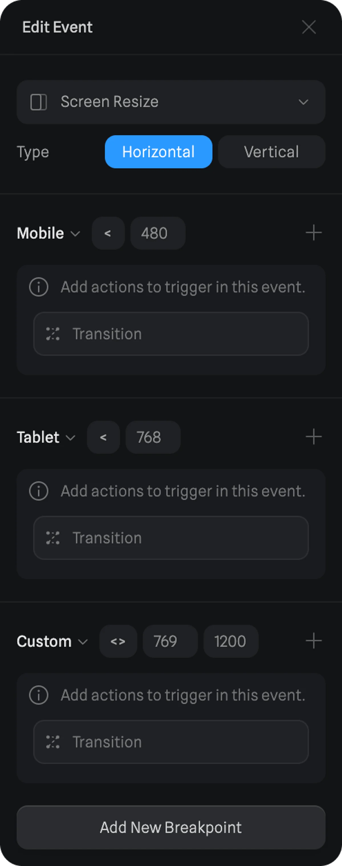
Settings for Screen Resize Event
Type
On type, you can define if the breakpoints on the event will be horizontal or vertical.Breakpoints
Breakpoints are defined by pixel values and an operator (> more than, < less than, and <> between).
Eg. On the UI to the right, on the Mobile preset, the actions will be triggered once the canvas becomes less than 480 pixels horizontally.
- There are 3 presets available (Mobile, Table, Desktop) or you can set your Custom values.
- To add a new breakpoint, use the “Add New Breakpoint” button at the bottom.
- To delete a breakpoint, look for the delete icon that appears on hover.
- To add a new action, use the + icon on the respective breakpoint you want to add an action to.

Actions
Here are the different actions you can trigger with the Screen Resize Event:- Transition Action
- Animation Action
- Sound Action
- Particle Control Action
- Video Action
- Create Object Action
- Destroy Object Action
- Switch Camera Action
- Scene Transition Action
- Reset Scene Action
- Set Variable Action
- Variable Control Action
- Conditional Action
- Clear Local Storage Action
- API Request Action

